Advanced CSS Design
Changing the Design of the Form
This is an advanced feature which infoodle does not provide support for directly. There are too many different things that could be done with CSS for us to effective provide support, and every website is different.
Use this feature only if you have experience with CSS.
This information is for those who want to be able to make changes to the design and layout of their form. It involves using CSS to make the changes. If you need to learn more about CSS, there is a lot of info on the web.
Here is one place to start : W3schools, or for something more in depth - CSS Tricks.
Where to place the CSS
There are two places you can add CSS. Directly on each field which it will apply, or at the form level so it applies to the whole form.
Applying at the field level
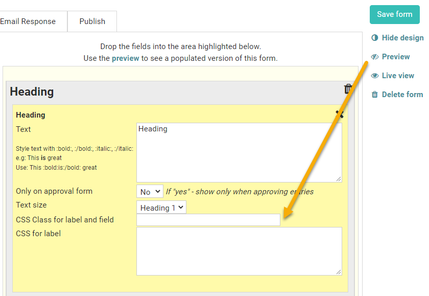
When you click a field you wish to edit, a link will appear below the Save Form button - 'Show Design'.
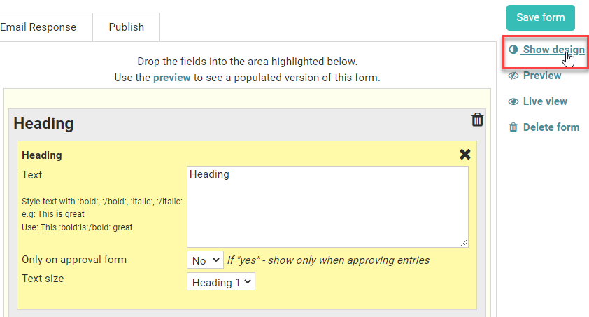
Click 'Show Design' and there will be two new boxes that appear in the field - CSS Class and CSS.
-
CSS Class -adds a single word into CSS and this will add the class name onto the form. Note that you will need to describe this class at the form level.
-
CSS - allows you to add text for this field. It does not need any selectors because it is added directly to the DIV element surrounding the label and edit box. e.g. font-size:2em
See the Examples section below for how you can change the width of your fields.
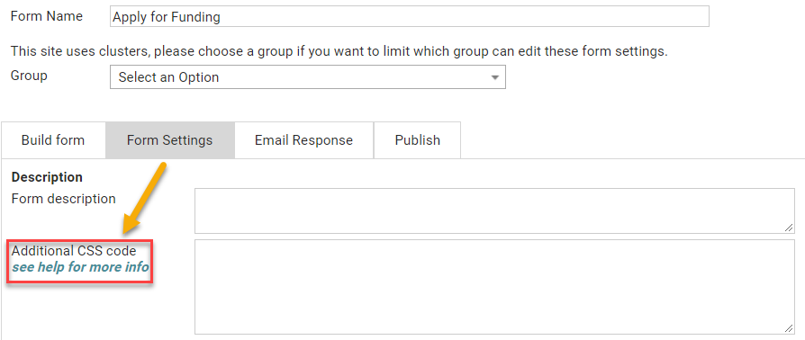
Applying at the form level
CSS added to the Form - Form Settings tab applies to the whole form.
This content is placed between style tags:
<style>...</style>
These are at the head of the form and as such will need to use the selectors to identify which elements you wish to change. Each element has a class so that you can style it - and is surrounded by an element ID if you need to get specific
.cellM {font-size:2em}
If you wish to style the Amount field using buttons, see here for more details.
Field level settings - examples
To change the width of your field
-
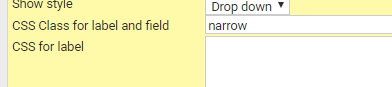
Click on the field you want to change in the build form e.g. gender
-
Click Show design
-
You now see 2 more fields available in 'gender' - enter the word narrow in the first box
-
Repeat this for any others you want to have the same width
-
Click on Form settings
-
In the CSS box enter the following
.narrow select, .narrow input {width : 100px !important}
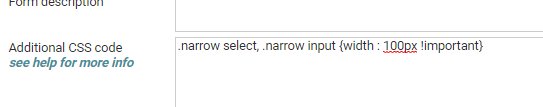
This will change all the drop down fields (as gender is) and any input fields e.g. a simple text box - or a tick box! - to be 100px wide.
To make the "short text" field the same width as the multiline text
The following sets the width of the fields to be 90% of the page (so it is responsive)
#content .cellM { width:90% !important}
Change the colour of the background (behind the white form area)
body {background-color:red}
This can be extended to include additional settings relating to how the whole form is displayed
Set the font, font size, line height, font colour for text lines and the background colour (behind the white form area)
body {font-family: "Helvetica Neue", Helvetica, Arial, sans-serif;
    font-size: 12px;
    line-height: 1.1;
    color: #333333;
    background-color: #fff;
}
Change the colour of the form background (behind the labels and fields - normally white)
#content {background-color:#d7d7d7}
Change the font used for the labels
.label {font-family:serif}
Change the spacing between the field rows - change the padding value to suit
.field_row {padding: 0px;}
Change the Horizontal Line thickness and colour
.labelwide hr {
    border-top: 5px solid #b6b6b6;
}
Change the layout so the entry boxes appear beneath the labels, not beside
You will need the following 3 lines
.data {float:none}
.label {width:90%}
.icoHelp {float:none}
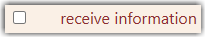
Tick Box - tick box before the label
For example:
This is set up as follows:
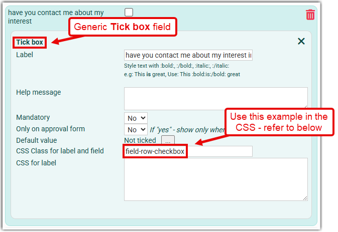
Note the use of .field-row-checkbox in the above - apply this to all instances of the Tick Box field in your form.
In the CSS below it's referred to with: .field-row-checkbox, where .dataentry is the portion of the row that contains the .label and .data (the tickbox).
For more information of flex: and order: within the .label and .data sections, see: w3schools - CSS3 flexbox items
.field-row-checkbox .dataentry {
    display: flex;
    justify-content: left;
    align-items: center;
 }

.field-row-checkbox .label {
    display: flex;
    flex: 1 1 350px;
    order: 2;
}

.field-row-checkbox .data {
    display: flex;
    flex: 0 0 50px;
    order: 1;
}
Group - tick box before the label
This is similar to the Tick Box above however the padding around the Group tickbox is different to that for the Tick Box tickbox, hence the additional line that includes padding for .radiopair
Note the need for a different CSS class, in this case named: .field-row-group
.field-row-group .dataentry {
    display: flex;
    justify-content: left;
    align-items: center;
 }

.field-row-group .label {
    display: flex;
    flex: 1 1 350px;
    order: 2;
}

.field-row-group .data {
    display: flex;
    flex: 0 0 50px;
    order: 1;
justify-content: left;
}

.field-row-group .radiopair { margin-left: 3px; }
Change the text beside a radio button go full width
.radiotext { width: calc(100% - 30px) !important }
Increase the spacing between an Independent checkbox label and the checkbox
.cellTickBox {margin: 3px 3px 3px 30px}
where the margin values relate to: top, right, bottom, left, margins of the checkbox.
Change the colors of the help tip box
.entryhelp {background-color: #000; color:#fff; border-color:red}
By inspecting the HTML you can see the classes and structure of the page such that you should be able to easily identify the info you need to be able to style it.
Reduce the size of images
The default is to show the image as you upload it - so it fills the available space. To set a maximum size you can use this to reduce to be a maximum of 50% of the available space.
.image {
    max-width: 50%;
}
or this to be a specific maximum width combined with the minimum size you want it to go to on any screen size - always consider these forms are shown on laptops, desktops, ipads and phones
.image {
    max-width: 50%;
    min-width: 400px;
}
Button Settings
Change the colour and corner radius of the Submit, Reset, Next or Back buttons
Buttons can be modified by setting their background and font colour, and the shape of the button for when the button idle and when the mouse pointer is hovering over the button.
By default each button can have a background image associated with them so to start with, this needs to be removed. Once this has been done you can set the button background and font colour, and the radius of the button corners.
The example below relates to the Submit button, however this similar for the other buttons as well:
.submitbutton {
background-image: none; background-color: red; color: white;  border-radius: 9px;
}

.submitbutton:hover {
background-image: none; background-color: blue; color: white;  border-radius: 9px;
}
where
background-color:defines the background colour (note the US spelling),color:defines the colour of the text,border-radius:defines the radius of the corners
For the other buttons, replace .submitbutton and .submitbutton:hover with:
- Next -
.button[type="button"]and.button[type="button"]:hover - Back -
.buttonSecondary[type="button"]and.buttonSecondary[type="button"]:hover
Amount Block (buttons) - change 'Other' to something else
This uses both CSS and Javascript. Change Your contribution to suit your needs.
.amtItemOther .amtButton { color: transparent}
.amtList li .amtButton {
    width: 120px;
}
</style>
<script>
function userPageLoaded() {
$(".amtButtonActive").html('Your contribution').css('color','#ffffff');
}
</script>
<style>
This does the following:
- CSS - sets the original text to transparent, then sets the button width to 120px (adjust for your needs)
- Javascript (within the script tags)- sets the button text to 'Your contribution' and resets the colour to white.
Amount Block (drop down) - change 'Other amount' to something else
Change Your contribution to suit your needs.
.currother {
  visibility: hidden;
  position: relative;
}

.currother:before {
  width: max-content;
  visibility: visible;
  position: absolute;
  content: "Your contribution";
}
Recurring Payment - change 'Once per month' to 'Monthly'
Add either or both suggestions below depending on whether the options are displaying as either Buttons or as a Dropdown list.
Buttons (using CSS)
/* Target the specific monthly button */
div.rcrButton[v="MTH"] {
    font-size: 0 !important; /* Hides "Once per month" */
}

/* Inject the new "Monthly" text */
div.rcrButton[v="MTH"]::before {
    content: "Monthly";
    font-size: 14px; /* Adjust this to match your form's font size */
    visibility: visible;
    display: block;
}
Dropdown (using Javascript)
</style>
<script>
function userPageLoaded() {
    // Target options in Dropdown menus
    var options = document.querySelectorAll('option');
    options.forEach(function(option) {
        if (option.textContent.trim() === 'Once per month') {
            option.textContent = 'Monthly';
        }
    });
}
</script>
<style>
Increasing the spacing at the bottom of a form - specifically when the form is viewed in the infoodle App
This may be needed to ensure that the Submit button displays above the Android navigation icons.
#main_submit_button {
    margin-bottom: 60px;
}