Grid Display of Form Fields
There may be occasions when you want to display form fields in a way that's different from the default layout (one field above another). One option is to utilise the CSS Grid feature. An example of this can be found here: https://demoinfoodle.infoodle.com/f/CSSGridExample
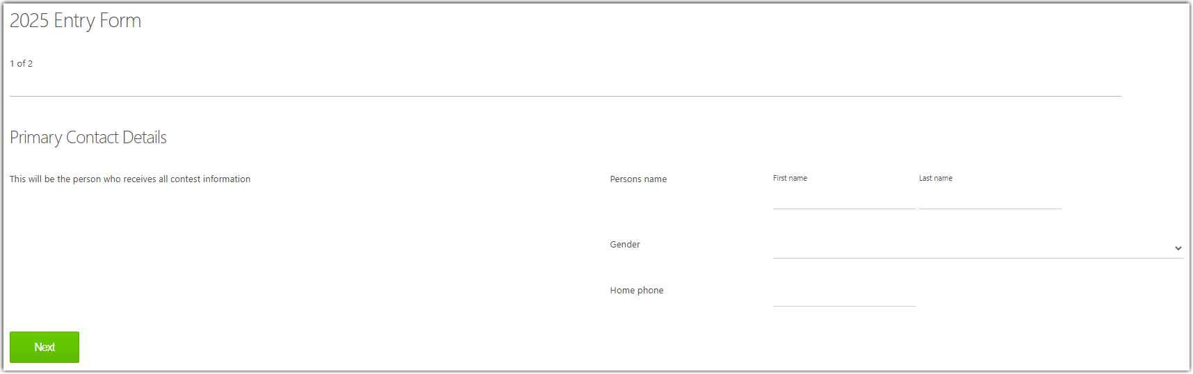
This form also includes page breaks to display fields on different pages.
Additional CSS has been added to replace the default full border around input fields, with only a bottom border. For example:
 /* Replace default text input field full border with only a bottom border */
input[type="text"] {border: none}
input[type="text"] {border-bottom: 1px solid #ccc}

 /* Replace default drop down field full border with only a bottom border  */
select {border: none}
select {border-bottom: 1px solid #ccc}
When building your form, each field is assigned with row number (starting at zero - "row0").
The CSS to the form above consists of: defining the grid and the number of columns (two in this case), then defining:
- the fields that span across the full width of the grid,
- the fields that should be displayed in the left column
- the fields that should be displayed in the right column
/* Change default layout of one field below another, to layout using a grid  */
.input_form {
  display: grid;
  grid-template-columns: 1fr 1fr; /* Two columns */
  gap: 1rem;
}

/* Spans across both columns - horizontal lines and the initial Next buttons  */
.row3, .row9, .row12 { grid-column-start: 1;
  grid-column-end: 3;
}

/* Left column */
.row4, .row5, .row10, .row11, .row13, .row14 {
  grid-column: 1;
}

/* Right column */
.row6, .row7, .row8, .row15  {
  grid-column: 2;
}