The Email Designer is a powerful tool for creating customised Email content and has many different features and design elements that you can incorporate.
You can use it to make your email correspondence look stylised and professional, as well as make it interactive by adding Menus, Buttons, etc.
If you have previously used other Email Design software such as Mailchimp, then you may already be familiar with this kind of design tool.
Introduction to the Email Designer
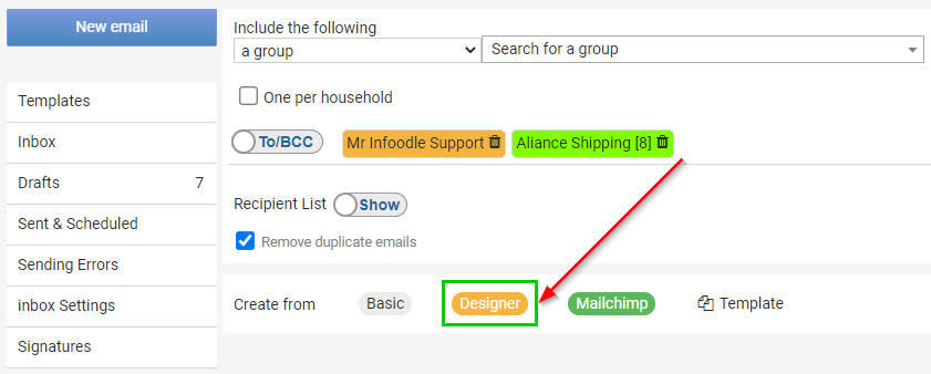
From the Contact screen, select the Designer option next to Create from.
Due to the many different Features, Options and Settings with the Email Designer tool we recommend first watching our short instructional video for an overview:
Overview of the Designer Page
The Designer Tool has a lot of different options and components but these can be loosely categorised into three main sections.
- Design Window - is where you will be adding your Email design content into, as well as arranging, reordering and editing that content.
- Content Panel - is where you select the content you want, then add by dragging and dropping into the Design Window. When you select content in the design window, the various options and settings for that content item will display in the Content Panel.
- Tabs - the Tabs Menu is used to switch between the four different sections of the Content Panel, each of which have a different function.
Below is an overview of the Designer Tool outlining the three main sections, as well as pointing out a few other important features:
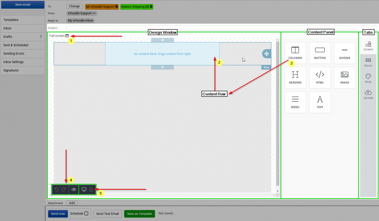
The five features we have highlighted above are:
-
Full Screen Button - click this button to Switch to the Full Screen Mode of the designer, which hides the infoodle menus, etc, and lets you focus on Designing.
-
Content Row - here we have highlighted a Content Row. You must have at least one Row to add content into. We give you a Single Column Row to start with.
-
Columns - use Columns to drag and drop additional Content Rows into the Design window. You can choose to add Single or Multiple Column layouts here.
-
Undo/Redo and Preview - these buttons are at the bottom left of the Design Window. Use Preview to get an idea of how your design will appear to Recipients.
-
Desktop or Mobile Buttons - these buttons let you switch the Design Window between Desktop and Mobile view and allows you see how content will change, resized and reordered based on which type of device it is viewed on. This allows you to make changes if needed to ensure your email displays as you intend.
Content Panel - Content tab
The editor comes with the following tools:
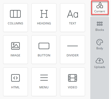
- Columns: It allows your users to add columns to your design in order to have a better design arrangement.
- Heading: Add headings (from level 1-6) to the design.
- Text: Text is a built-in tool so users can add text to their designs.
- Image: To make your emails attractive, you can add images using this tool.
- Button: Add any type of button in your email. You can change colors and styles.
- Divider: It gives your users appropriate spacing at any point they want in their design.
- HTML: This tool will give your users room to add custom HTML to the design.
- Menu: Menu is a built-in tool used to create navigation menus that provide options to: open external websites, send an email, call a phone number or send a SMS text message.
- Video: It lets users add YouTube or Vimeo videos to their designs. This tool automatically generates thumbnails of videos for emails and ensures that it renders correctly on all platforms.
Content Panel - Blocks tab
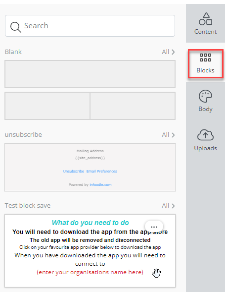
This tab stores the various blocks previously created and saved for later use.
Content Panel - Body tab
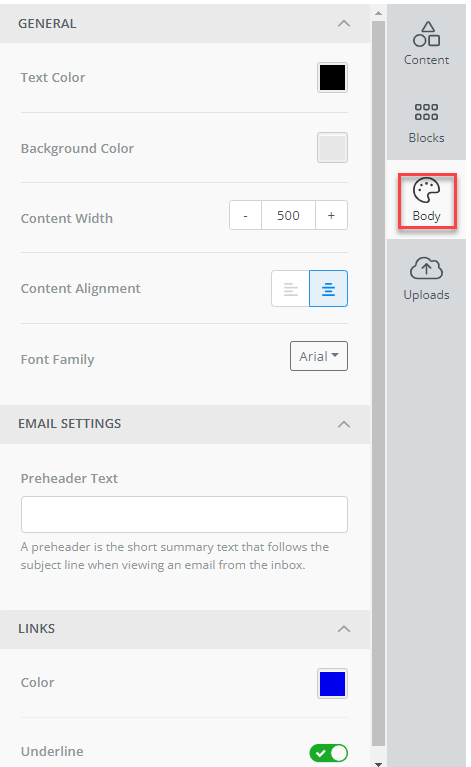
This tabs contains the gobal settings for blocks added to the content:
- Text colour
- Background colour
- Content width
- Content alignment
- Font family
- Preheader text - the text displayed in the likes of GMail, that follows the subject line when viewing the email.
- Link colour
- Link underlining
Once a block is added to the content panel these settings will be applied to that block.
If desired, the settings for individual blocks can be revised to suit your requirements by editing each block.
Content Panel - Uploads tab
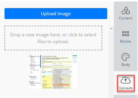
This tab provides the ability to upload images in to the email system for storage and later use within emails.
Fullscreen Designer Preview
Below you can see an example of the Designer Tool when it is in the Full Screen mode.
As you can see, it now takes up most of the screen, and hides the infoodle menus and email settings that we won't need while we are working on our design.
-
To go back to the Standard View you can simply click the Restore button in the top left of the page.
-
infoodle will periodically save your progress as a Draft. This is indicated next to the restore button (or next to the Save As Template button in Standard View).
-
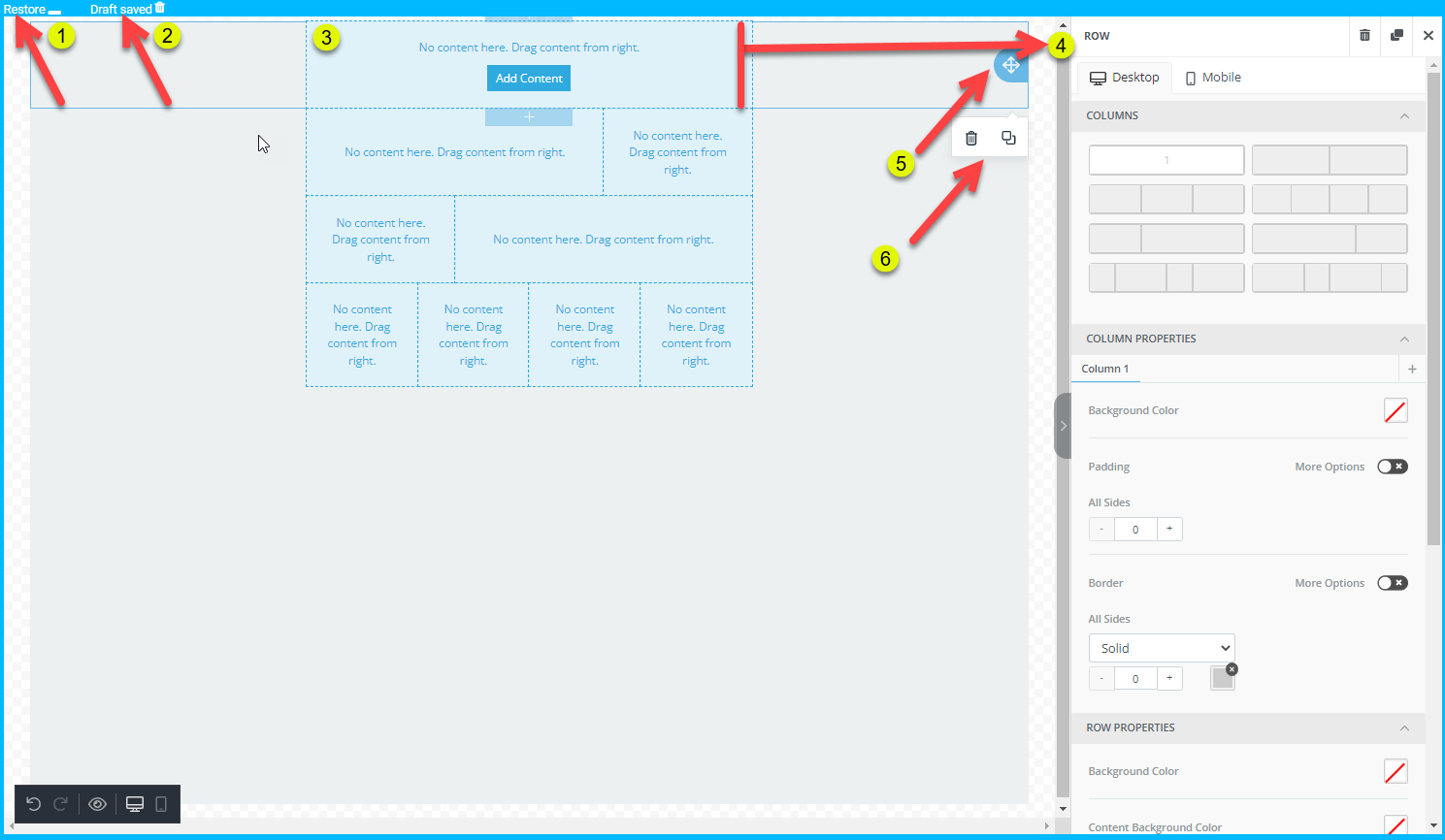
For this example we have added in some additional Content Rows to show some of the different Column Layouts that are available to you.
-
Having selected the top row in the Design Window, you can see that we now have the configuration options and settings for it displayed on the right hand side.
-
Move - The Double Arrow lets you move the entire row and the content within it by clicking the Move Icon and Dragging/Dropping the Row to a new position.
-
When no content has been added to a content block there are two icons displayed:
-
Delete - Select the Trash Can icon to Delete the entire row. Note: deleting a row will also delete all content within that row.
-
Duplicate - Select the Duplicate icon to create an exact copy of the current row. This will appear directly underneath the copied row..
-
7. When content is present there is an additional row operation available, Save.
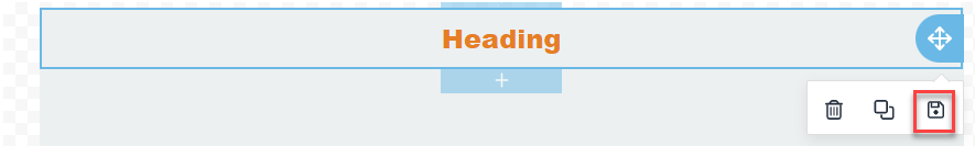
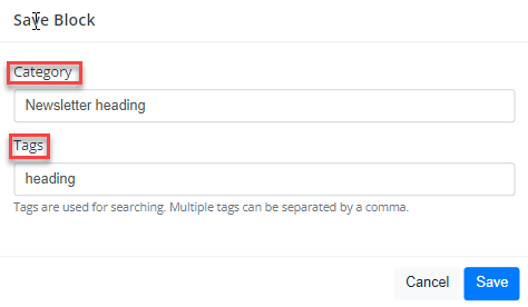
The Save option provides the ability to save the content block for reuse.
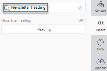
Enter a category name (Newsletter heading) and any associated tags (heading)so that you can find and search for the block:
Once saved the block is displayed within the Blocks tab.
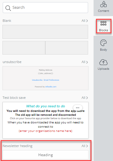
Selecting the All> indicator displays all blocks saved under that category, in this case, Newsletter heading: