Here is an example of a Home Page created through infoodle Administration:
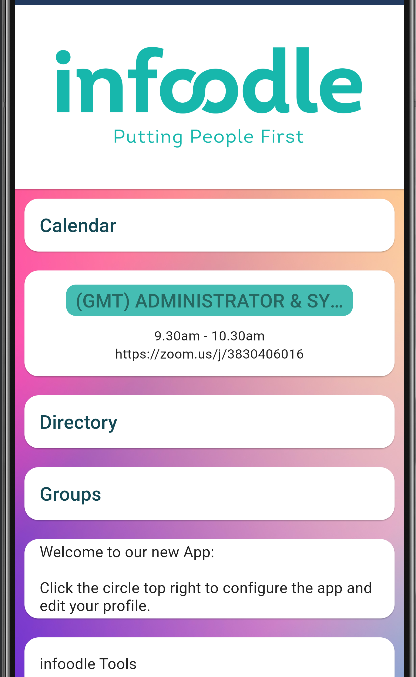
The various items displayed, and their display order is managed through infoodle Administraion.
When setting up the the display options in Administration, it can be handy to have the App open on your mobile. Each time you make a change, refresh the display to view (typically by pulling the App screen down).
Each block is configured separately and can perform different functions. The logo and content are up to you - so get creative!
Getting Started
From the infoodle menu, select Administration then Phone App.
The following options are displayed:
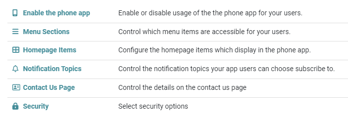
Start with Home Page Items:

Home page configuration settings
 {height="" width=""}
The background image will be displayed on the home page behind any of the items that you have configured to show. This can be from one of the selected images we have included, or upload your own to set the tone of your app.
 {height="" width=""}
The home page will display a vertical list of items of the type and order that you configure. Choosing 1 column (the default) will show them full width and on top of each other. Choosing 2 column will show the items in two columns. They are loaded left side starting at the top then to the bottom, then to the right side top then the bottom. This option allows you to show more features on the home page.
Note that using a "Spacer/Header item" with Display As "Image with no background" first will display this covering the full width of the screen for both 1 and 2 column displays.
To add your first item - click Add
Add a Homepage item
You are first asked for a Type.
There are currently nine different types available to you. These perform different functions for the user to interact with, each explained below.
Note that you can have as many of these as you wish, although for a home screen you may want to keep that a small number.
| Type | Why | e.g. |
|---|---|---|
| Link to Webpage Within App | To show come web content that is hosted on another website. Show it as if its part of the app. | Live Stream. Podcase Series, infoodle Form, Youtube Video. |
| Link to Webpage Outside the App | As above but will launch the users own browser. Some content needs this option. | Facebook page |
| Link to PDF | Shows a publicly accessible PDF document. | Newsletters. Training manual |
| Spacer / Header Item | A non-functional block prarily used to show your logo at the top of the page. This is a full width image | Your logo |
| Link to Directory | Takes a logged in user to screens to search the directory, edit details, workflows and ToDos all based on rolls | Just the infoodle Directory |
| Link to Users Groups | Allows a logged in user to access the groups they are full member or administrator of | |
| Display Today's Events | Shows any events that are in the infoodle calendar scheduled for today | Jut infoodle activity filtered as per the users current settings and only those events they can see |
| Link to Calendar | Shows a week at a time view of the infoodle events | Just infoodle events |
| Link to Users Own Roster | Shows the users rostered activities | Just infoodle rosters |
| Link to infoodle App Tools | Show a range of tools for the users to interact with including managing groups | Just infoodle tools |
For more information see infoodle Tools.
If you are going to include the Calendar in the infoodle App, ensure that events you wish to be displayed in the App are visible.
If they are not being displayed, see the information in Adding an Event.
Display options
Having selected which type you want, you can now add on further configuration depending on what the type is.
1. Display As
Here you can choose how you want the items displayed. There are currently four options.
Always consider the fact that people look at this content using different sized devices, and in a different orientation e.g. an iPhone held vertically is different to one held horizontally. The infoodle app displays your content as best it can within those parameters.
1. Multiline Standard Text
This uses plain text (no styling is available) which applies over one or more lines.
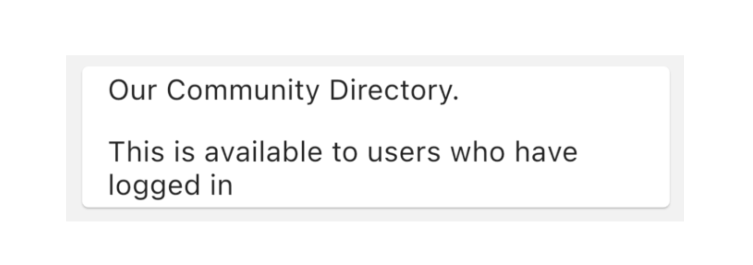
This can be great to communicate a message for new users each time they open the app, or a way of describing a link.
2. Single Line Title Text
This uses plain text but in a larger, bolder font. It will only show on one line.

3. Image on a Card Background
This allows you to add an image of your choice, and will display it on a white background ‘card’.
This can be a nice presentation of your images.

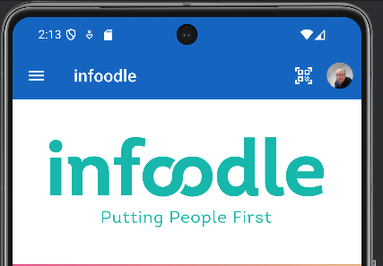
4. Image with No Background
If you dont like the white card, you can opt to not use a card at all. This can be good for logos.
For information on adding more items, see Left-hand Navigation Menu.
2. Label.
The label is used to describe the link for the user to understand what it is, for example the “Weekly Calendar” is showing the label text.
This label is also used as a header for the pages the user is taken to when they click the link.
3. Access.
Every item shown to the user can be either shown or not shown to the user based on whether they are logged in or not. For instance, you may want to expose a document to only those who are logged in to your community.
Likewise, you may want content that is that is relevant to any public users that want to interact with your community.
Commonly you would have content that's available to all users regardless of whether they are logged in or not.
4. Content URL.
For items such as pdf files and web pages, you will want to take the user to some content. This is the place where you enter that content. For example you may have a pdf on your website that you want to have in the app, just paste in the link to that document here.
For pdf, you are able to upload the file directly to the Add File area so that infoodle will host it for you.
Here are some links to add specific types of content: